
Alyssa Dumire, Director of Children’s Education
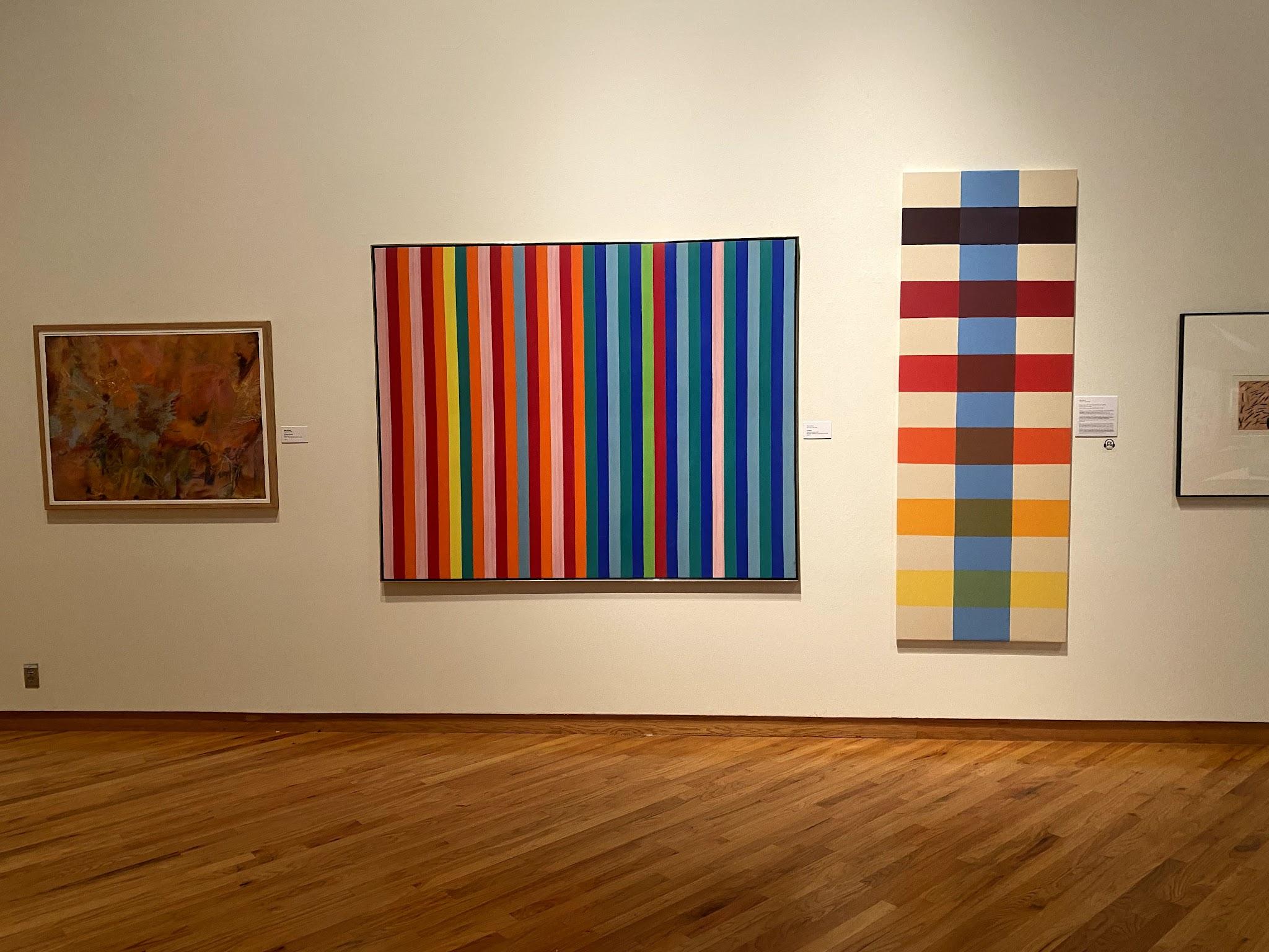
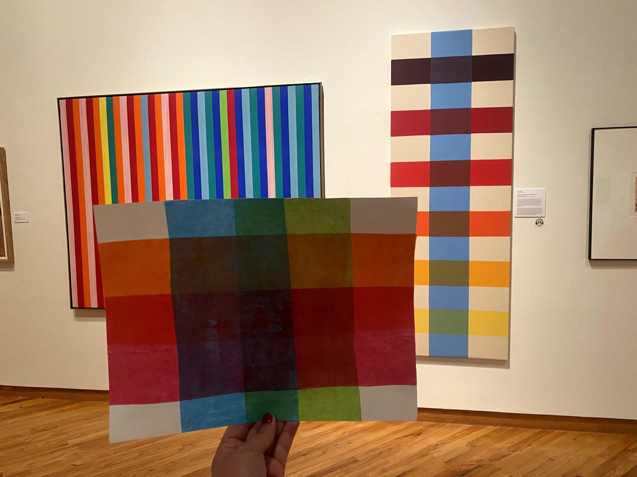
If you’re drawn to bright colors, step into our main gallery entrance and turn to the right–two paintings will definitely catch your eye. They share a similar, stripy sensibility and even some of the same colors, perhaps leading you to wonder whether they were done by the same artist. Spoiler: they weren’t! But, the two were close friends! Gene Davis (the vertical stripes on the left) and Paul Reed (the plaid-like painting on the right) attended the same Washington, D.C. high school. They both turned to painting after careers in other fields: Davis was a journalist, and Reed, who started painting slightly later, a graphic designer.

Gene Davis became known primarily for his vertical-striped paintings of all sizes (even setting a record for the largest painting in the world!). Paul Reed, however, worked in a variety of series, experimenting with different colors across similar compositions that built in complexity before he moved on to a new idea. His Coherence series was inspired by Jackson Pollock’s Blue Poles (aka Number 11, 1952), in which, as suggested by the title, almost-vertical blue lines interrupt Pollock’s signature allover drips. In FWMoA’s Coherence XV, the vertical stripe, like Pollock’s “poles”, is blue; but, they weren’t always. While both paintings are abstract and have a strong sense of rhythm from their repeating lines, the similarities stop there! Reed dabbled in Abstract Expressionism (AbEx) early in his painting career but soon switched to thinned paint to stain unprimed canvas, a technique he picked up from fellow Washingtonians Morris Louis and Kenneth Noland, who in turn had picked it up from Helen Frankenthaler. Louis, Noland, Reed, and Davis, along with Howard Mehring and Thomas Downing, became known as the Washington Color School after they were all included in a 1965 group show called Washington Color Painters. Their work was not only geographically distinct from New York School AbEx but, as seen in comparing Reed’s work to Pollock’s, was generally more orderly and less gestural, more emotionally “cool” rather than expressive and personal.

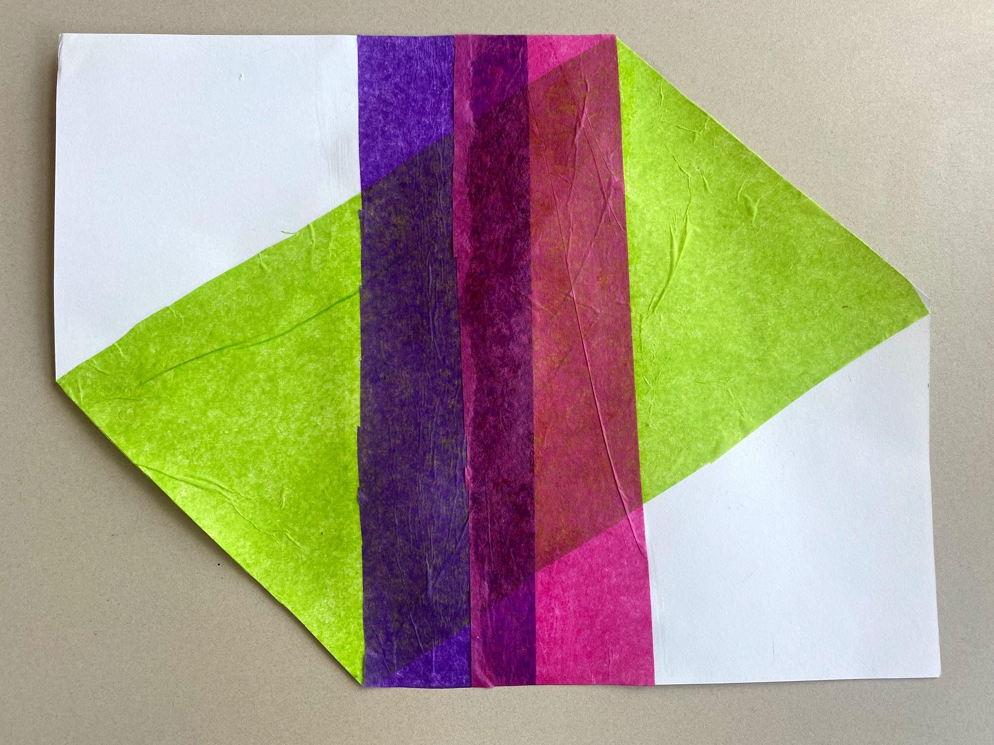
Look closely at the areas where stripes intersect in Coherence XV. Rather than mixing the two colors together on his palette, Reed took advantage of the translucency of then-new acrylic paints, creating this overlapping, plaid-like effect by actually layering thin veils of color. Reed became known as an expert colorist–while Morris Louis eventually abandoned his Veil paintings that used a similar technique when he couldn’t achieve his desired intensity from the overlapping colors, Reed’s hues maintain their vibrancy. Rather than battle with paints that might not mix well, we’re going to experiment with translucency and color mixing using tissue paper!
You’ll need:
- Colored tissue paper
- Mod podge or thinned glue and a brush to apply it
- Scissors
- Paper
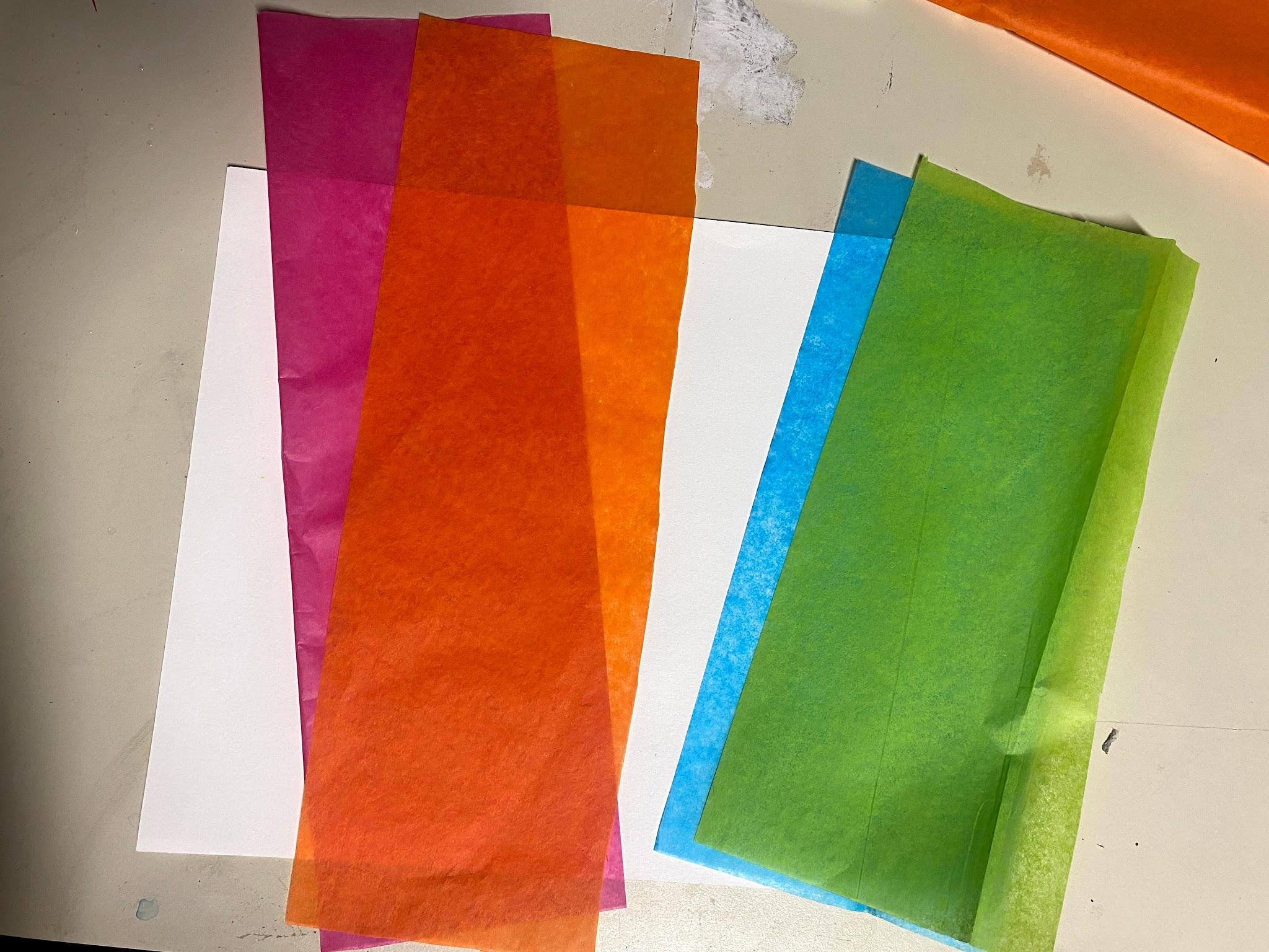
Choose two pairs of colors. I’m using pink + orange and blue + green. Stack one pair of colored tissue paper and cut a strip the length of your paper or slightly longer (this way they’ll both be the same size). Cut the other pair the same way but slightly longer than the width of your paper (the shorter side).


Now, decide how you’ll layer your colors! Lay out one pair of colors side by side but overlapping slightly, then run the other pair of stripes in the opposite direction so they all meet in the middle of the paper. Try a few different configurations, noticing how the colors blend differently depending on the order in which they’re layered.


I settled on orange-green-pink-blue. Apply your mod podge or thinned glue to the entire area of the paper that will be covered, then carefully lay your first stripe down, trying to avoid wrinkles (but don’t worry if you have a few–repositioning the tissue paper too much will result in rips).
Apply more glue where the next stripe will go, being extra careful if your tissue paper is the kind that bleeds (although you might like the bleeding effect!). Continue layering until you’ve used all four stripes.
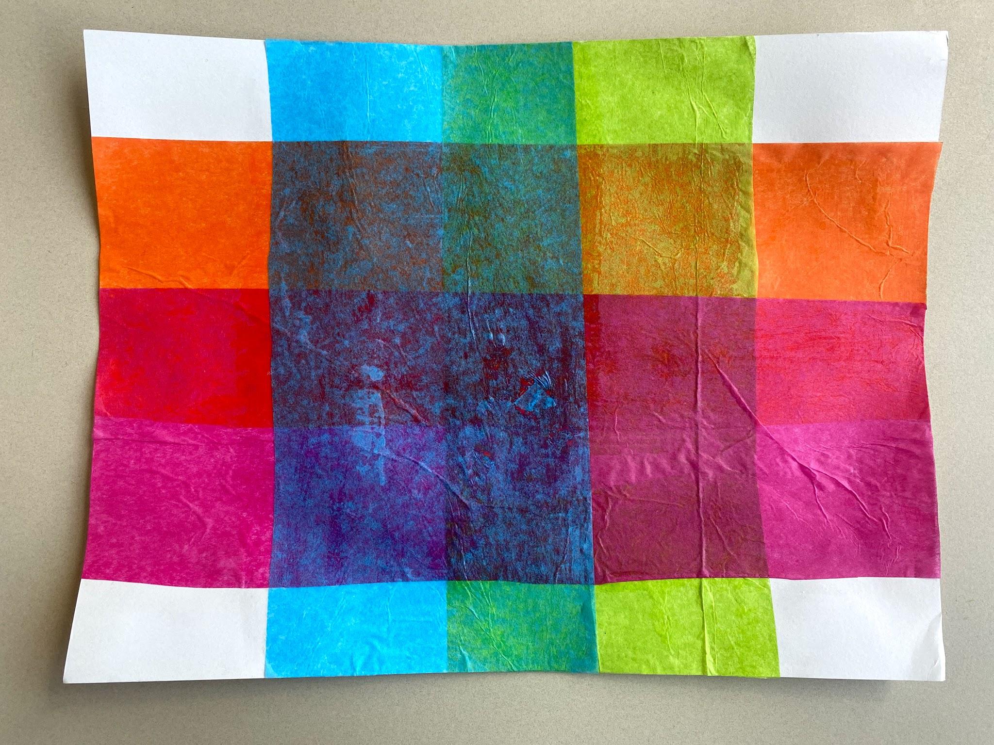
Let it dry, then trim any overhang from the edges.
Once you’ve tried this “plaid” composition, maybe you’ll want to experiment with others! Try shaping your “canvas” (cut your paper into a shape) as Paul Reed often did, or use different shapes of tissue paper.
Share your work with us!