
Alyssa Dumire, Director of Children’s Education
“What’s the most valuable work of art in the museum’s collection?” is a question we often receive, and not one that I’ll be answering today, at least not in the way you might hope. Value is one of those art terms with multiple meanings, like medium (the size or the material) or tone (the color or the feeling). As another element of art, value refers to the level of lightness or darkness within an artwork, rather than its worth. Along with hue and saturation, it is also one of the components of color–some colors are inherently light in value (yellow), while others tend to be dark (violet). Value is best illustrated, however, in the absence of color. Take, for instance, Clyde Butcher’s photographs on view through January 30th.

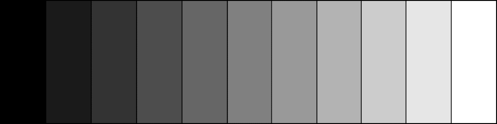
Perhaps the most value-able (in terms of the range of light and dark) works on display currently, Butcher’s large-scale, black-and-white photos don’t need color to catch your eye, instead relying on a full range of value, from bright whites to inky blacks (and all the grays in between). To where are your eyes drawn when you view Mammoth Hot Springs Terraces #8, above? I notice the bright spot of sunlight towards the middle of the image, but I’m also drawn to the dark line of trees against the clouds. When light and dark values are placed against each other they create contrast, adding a sense of drama that grabs our attention. Butcher often uses filters when shooting and darkroom tricks like burning and dodging to increase contrast and achieve his desired range of value. Look at the value scales below, then back to the photo: each step of the scale is represented, a mark of Butcher’s expertise in the darkroom.

In drawing, and especially printmaking, there are various systems for creating value. The smooth shading that an artist might strive for in a photorealistic charcoal or graphite drawing is not possible with pen-and-ink or etching, so other methods are used. Relief prints like linocuts and woodcuts (below) are inherently high contrast–the raised areas print black (or the chosen color of ink), while the areas carved away allow the paper (typically white) to show through.
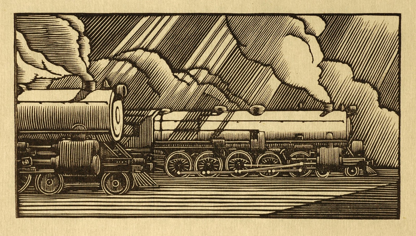
To create the in-between values, Rockwell Kent carved parallel lines of varying widths and distances apart, tapering them to fine points as they near areas of highlight. This is a precise version of hatching, while other artists might prefer cross-hatching using perpendicular, intersecting lines. Kent’s hatch lines are particularly bold, but when viewed at a distance (or zoomed out), they still visually blend to create mid-toned grays.
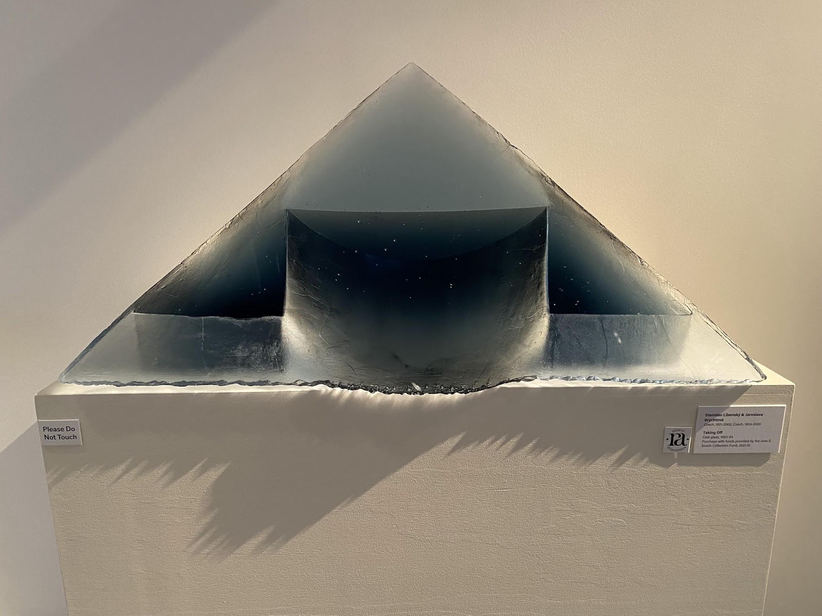
Glass artists experiment with value too! The translucency of glass means that a work in a single hue can have huge variations in value depending on its thickness. This is particularly apparent in cast glass pieces like Taking Off, where the thin lower portion contrasts sharply against the edge of the base, which smoothly transitions to a much lighter value as the glass slowly thins again. Here, value emphasizes the depth and adds definition to the shapes within the larger triangular sculpture.

Understanding value also helps us understand how colors function together. In Leo Valledor’s Between the Lines (above), the titular lines in warm colors have a vibrating effect against the cool blue background. This is partially due to their positions on the color wheel, but take a look at the painting in grayscale…
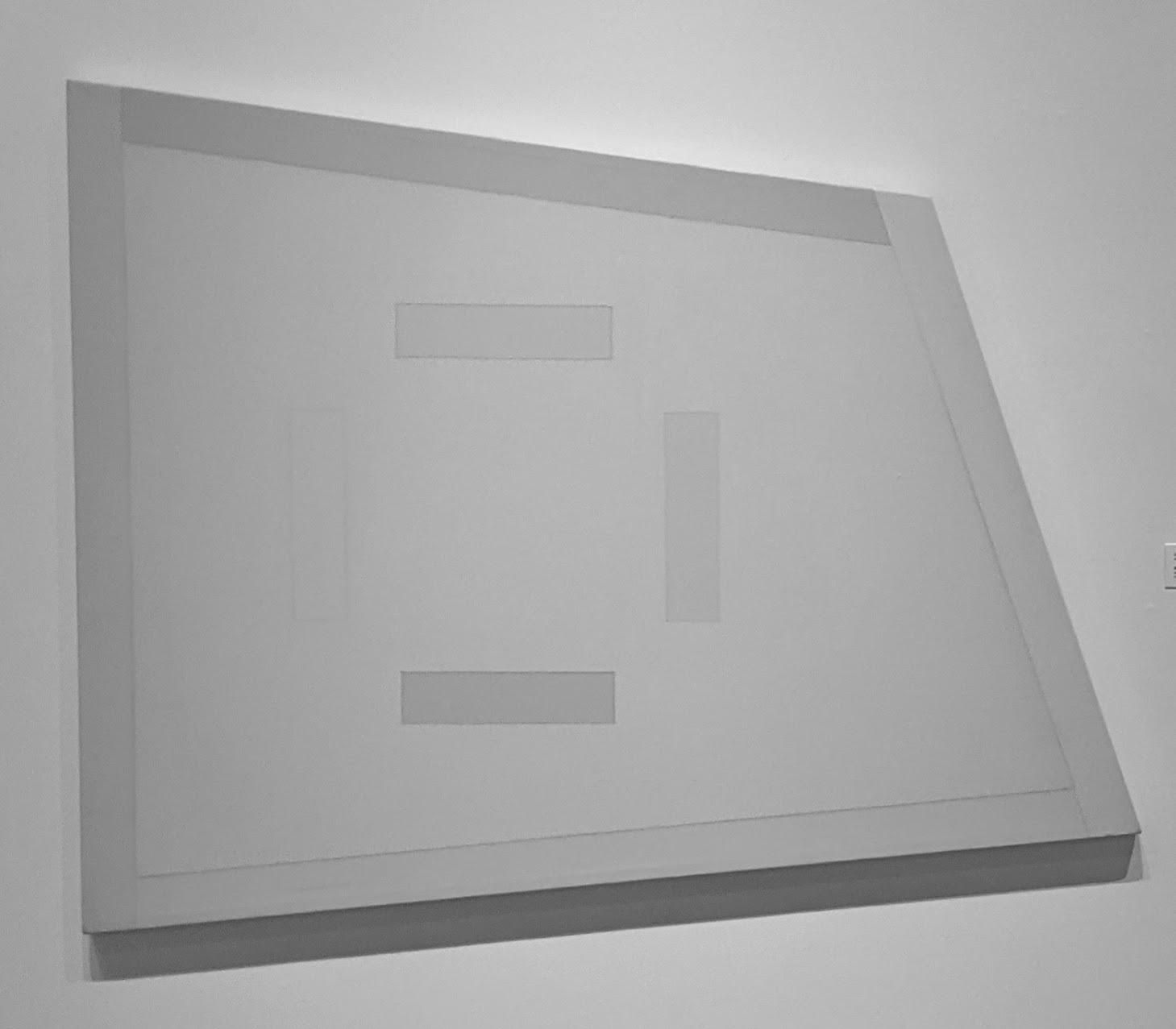
Now that we are only seeing the values, we can see that they’re nearly the same across the painting, heightening the vibrations. They’re also all quite light and low in contrast, which we call “high key” color (works that only use colors on the low end of the value scale are–you guessed it–”low key”). The next time you encounter a colorful artwork that messes with your eyes, snap a photo of it with your smartphone and lower the saturation to zero! You might find surprising results, and you’ll have a better understanding of why it has its optical impact.
2 Replies to “Art Term Tuesday: Value”