
Alyssa Dumire, Director of Education
Now that we’ve identified all the elements of art, the parts and pieces of an artwork, we can move onto exploring how they’re arranged and work together through the principles of design. The first, balance, is used to create a sense of visual stability within a work, much as it does out here in the physical world. Picture a seesaw: if identical objects sit on either end it balances while if one object is heavier the scales are tipped in favor of that side. Adjustments can be made to account for this added weight: changes in position (moving closer or further from the center fulcrum) or number of a visually lighter object (think of a large box of feathers versus a smaller dumbbell) can bring the seesaw back to equilibrium.
Symmetrical balance, in which objects on either side of an axis mirror each other (exactly or almost exactly), lends a sense of stability, stillness, and formality to an artwork. Government buildings and other institutional architecture often employ symmetrical balance, as does religious art. Symmetry is most commonly bilateral, with a line of symmetry down the center either vertically or horizontally, or both. Imagine folding the print by Amado M. Peña, below, in half vertically. The sides would very nearly match up (a keen eye may spot very slight differences)!

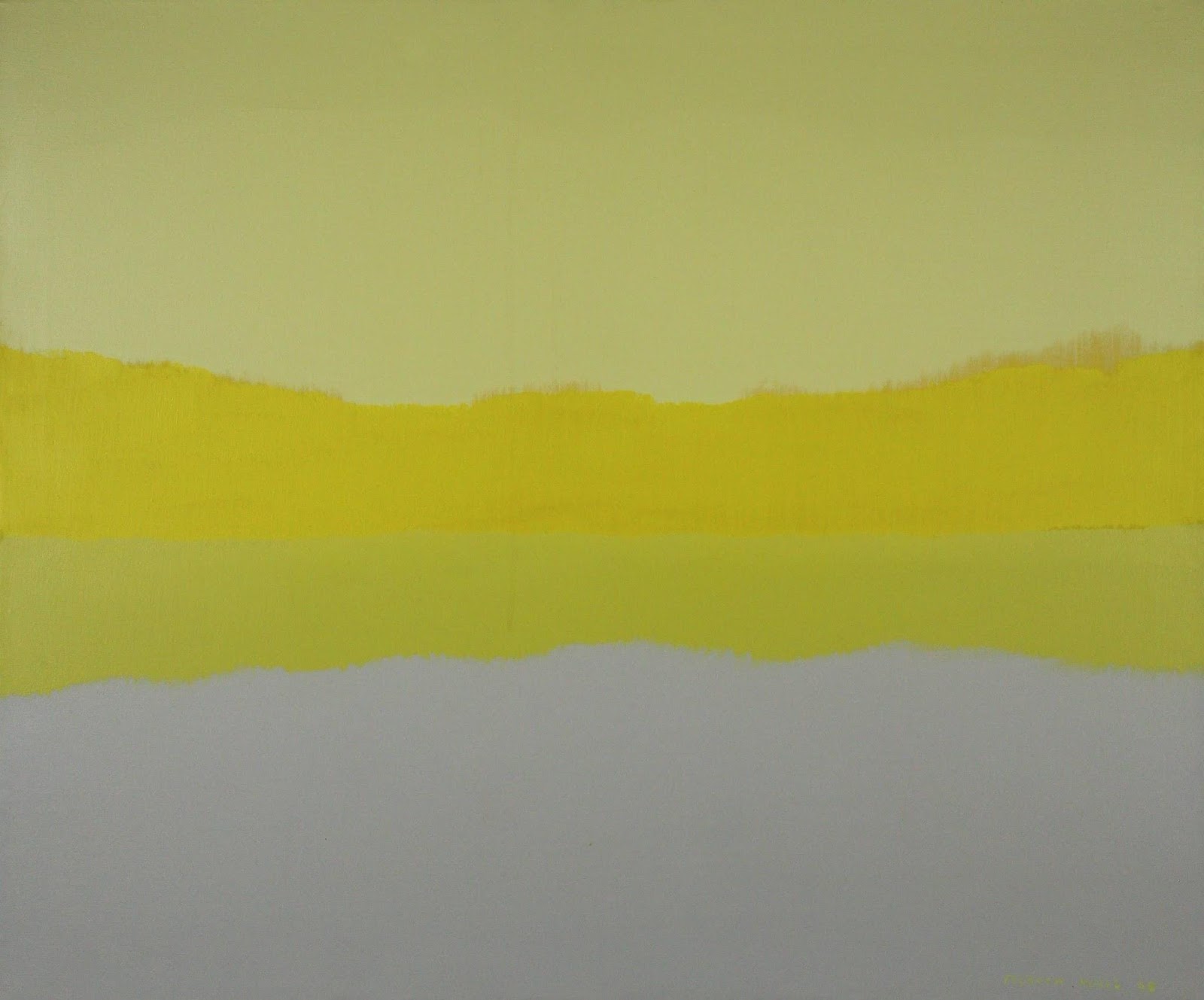
Felrath Hines’ Morning, below, uses a horizontal line of symmetry to evoke a sense of stillness and calm.
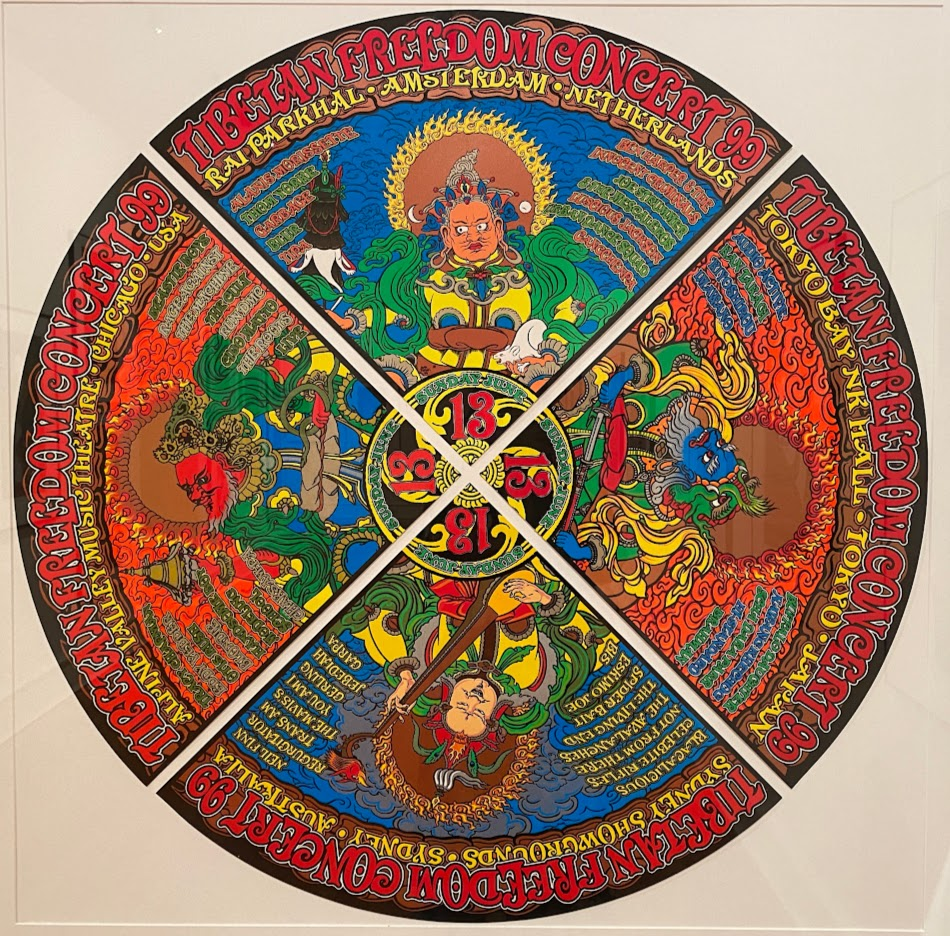
Radial symmetry occurs when elements are repeated around a central point rather than a line. Flower petals and spokes on a tire display radial symmetry, and it also appears in religious art like mandalas. Chuck Sperry’s four posters for the Tibetan Freedom Concerts, when pieced together, form a mandala-like composition with rough radial symmetry while the star on the quilt below radiates from a central point with precise repetition.

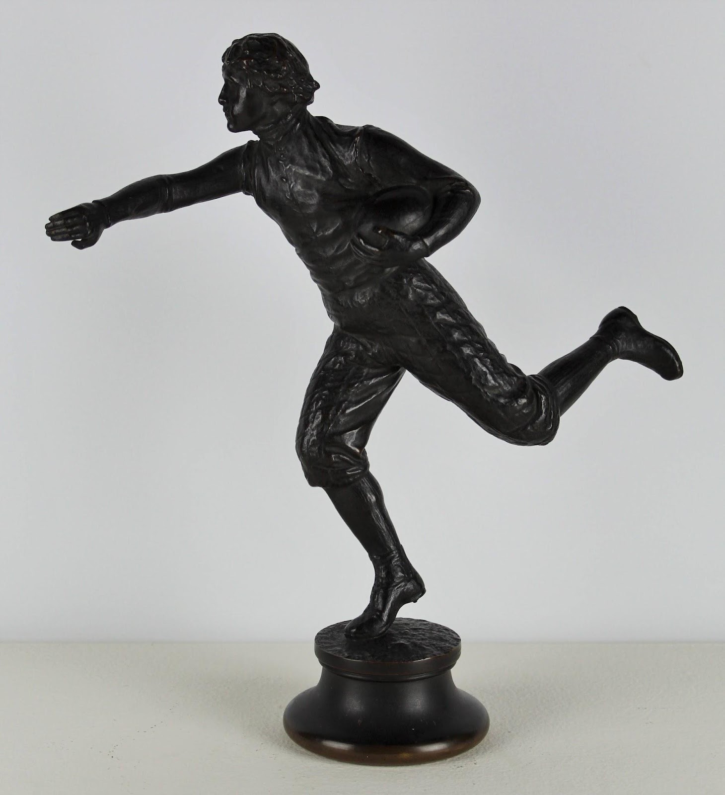
Artists can use asymmetrical balance to achieve a greater sense of movement or action. That movement should guide your eyes around the artwork in a way that keeps them within the frame–if you feel like you’re being led out of the picture plane, that’s a major clue that the artwork is not balanced. Browsing our collection, it was difficult to find a work that is not balanced! Of course, accomplished artists rarely create a work that lacks balance, but may deliberately evoke a sense of instability. Jonathan Scott Hartley’s Football Player is not fully off-balance, but is quite precarious on his toes–we can tell he’s mid-stride, his pose creating a dynamic sense of tension.
How, then, do artists balance objects within an artwork without relying on symmetry’s mirror-image? We first need to understand that each element within an artwork suggests a certain amount of visual weight in relation to the others. Color, amount of detail, and size all play important roles in how much a given element “weighs.” This means that a small, bright shape can be offset by a larger, more muted one. Position impacts weight, too: shapes closer to the edge or corner tend to pull our attention, so a large shape near the center of a composition can be balanced by a smaller shape that is nearer the opposite edge. Let’s look at some examples!

William Gropper’s The Gourmet is a classic example: the large diner at right is balanced by the four, much smaller waiters on the left. Even with a greater number of people on the left, the table and the man seated at it still occupy more space, but this is further offset by the amount of detail included in the various foods and serveware on the trays.

In the Chang Shu Chi watercolor, above, the branch and flowers on the left fill more of the page, but the placement of the bird (slightly further from center), and amount of detail in its feathers achieve balance. It also balances vertically, with the large cluster of flowers on the lower half and the three smaller elements above.

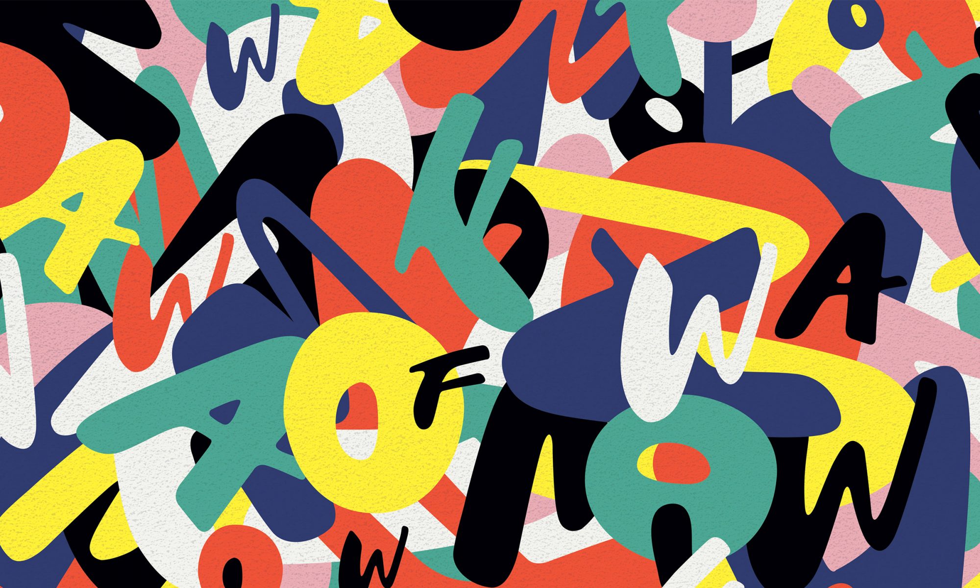
This David Shapiro painting is approximately symmetrical vertically (if we draw the line of symmetry horizontally), but quite asymmetrical horizontally. Is balance still achieved? In this case, the large half-plus sign on the left, which is relatively visually “light” with its thin outline, is balanced by the all over array of smaller, more complex shapes on the right.
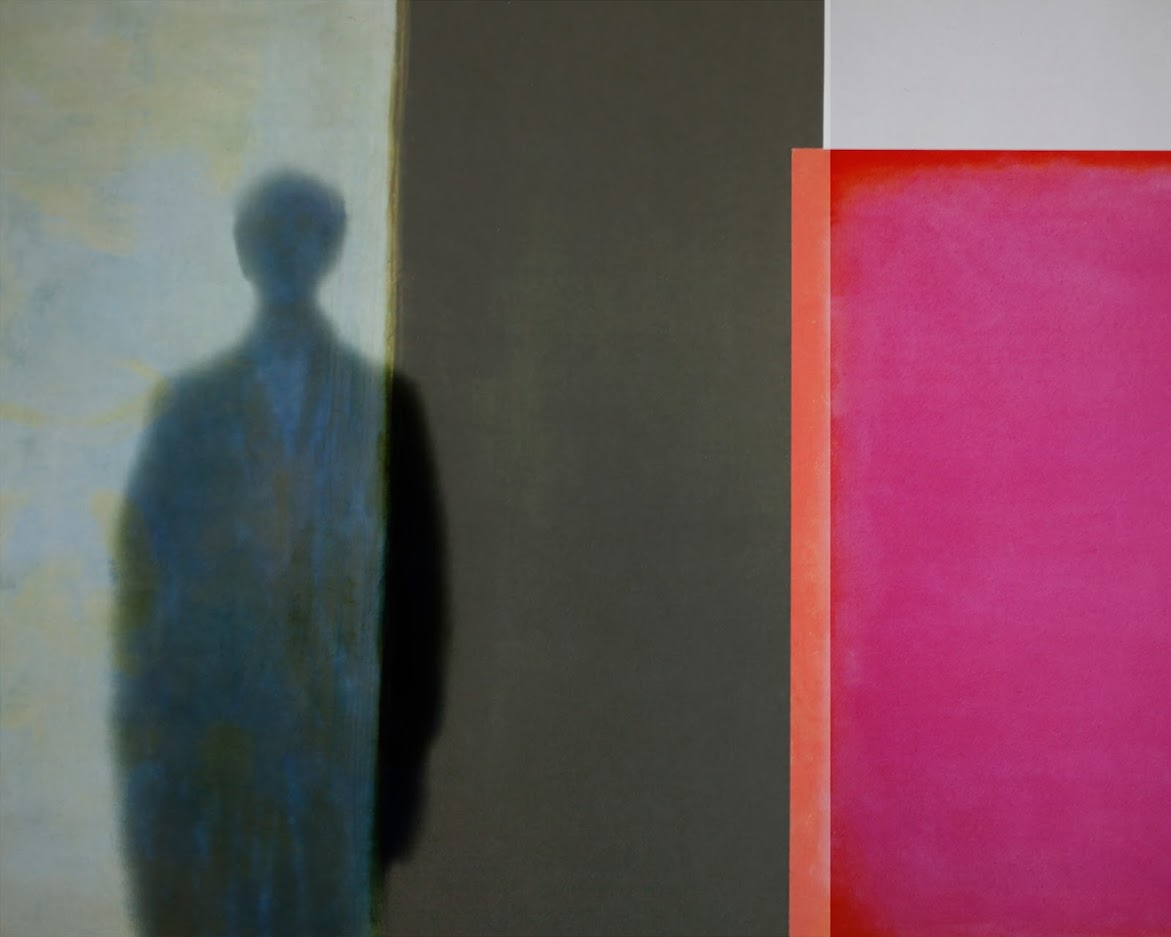
In Bill Armstrong’s Partial Appearances #1700, the bold color is concentrated all on one side of the photograph but is balanced by the more complex shape and the hint of detail on the left. Although I’m always drawn to bright colors, the mystery of that shadowy figure holds its own against the vibrant pink and orange.
Balance, or the lack thereof, is often intuitive: the next time you view a work of art, pay attention to your immediate emotional, or even physical, response. Does it feel stable, or is something “off” (if you were to pose like the artwork, would you tip over?)? Then, see if you can identify why! Which parts of the work have the greatest weight, and did the artist pull off their delicate balancing act?
One Reply to “”