
Alyssa Dumire, Director of Education
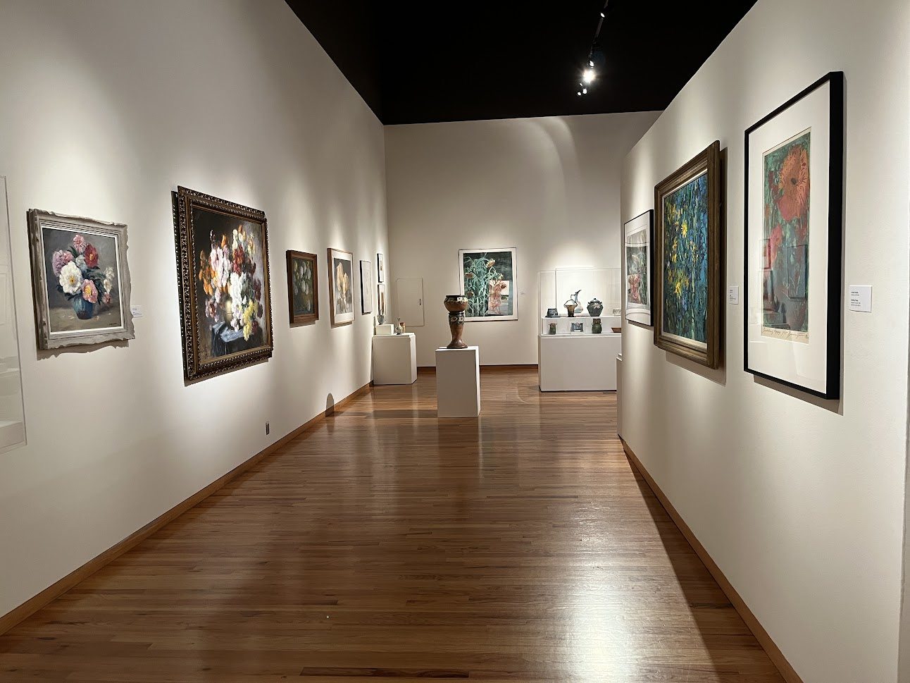
In Lush and Lavish: Blooms in Art you’ll find all kinds of ways flowers have inspired artists over the years, from the decorative to the symbolic. What do flowers remind you of? Perhaps it depends on the variety or color of the bloom. For some artists, botanicals are a way to represent the life cycle: you might notice how, in even the most pristine still life (like Lothar von Seebach’s, below) artists depict a few fallen petals. In addition to making the painting more realistic, these remind us that our favorite flowers don’t bloom for long!
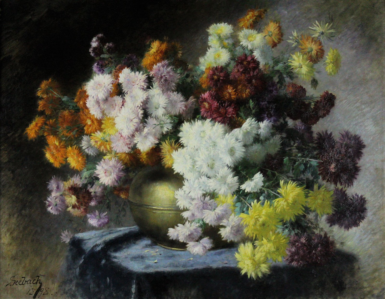
Both Seebach and Betty Hahn, below, depict chrysanthemums. Do their works share any other similarities?
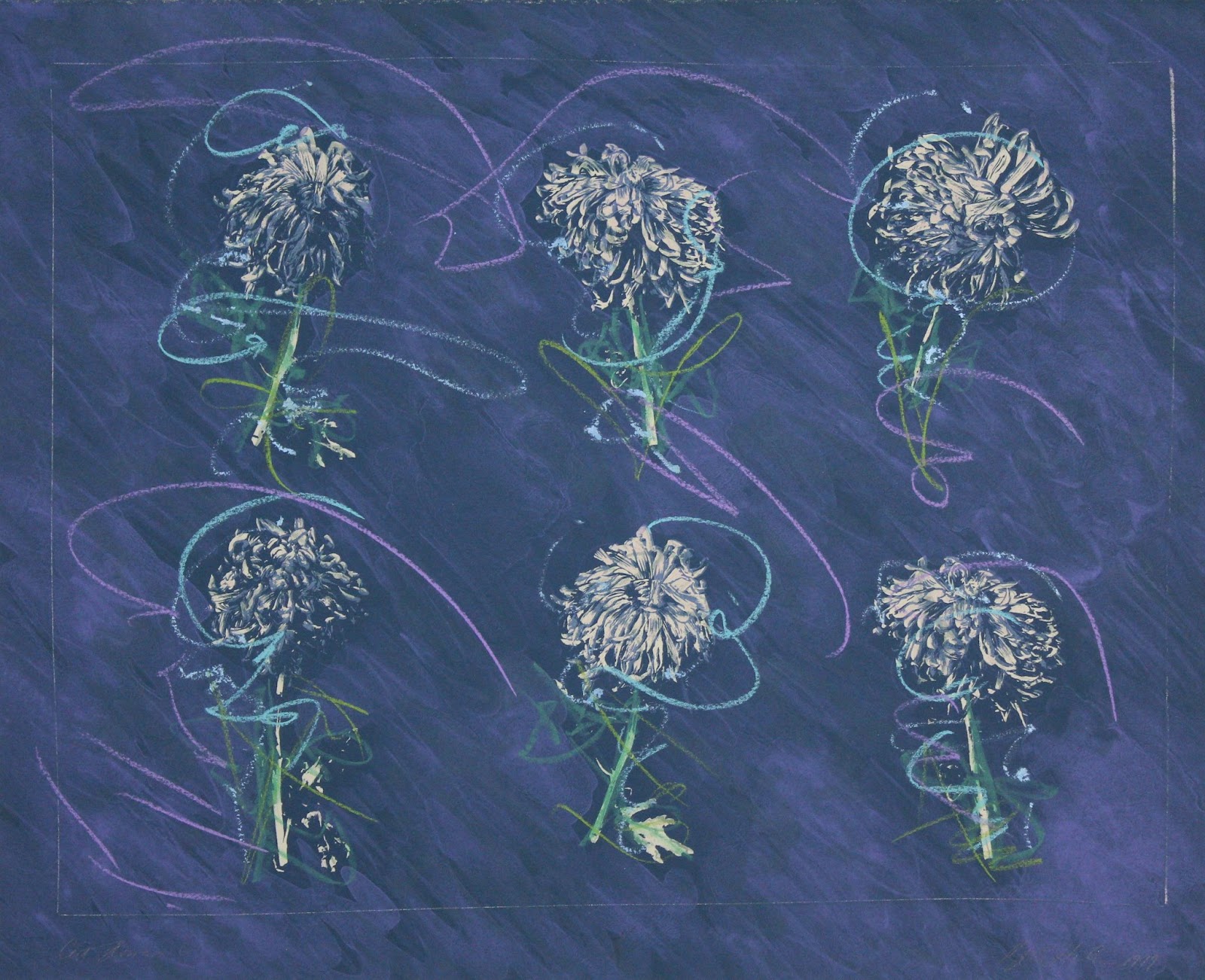
Rather than resting in a vase, Hahn’s mums float against a blue-violet background with swirled lines of color that lend a sense of movement, as if they’re spinning in the air. Seebach’s flowers are a variety of hues, and as he painted this near the end of the Victorian era, when people were well-versed in the “language of flowers”, he probably knew the meaning of all of them! Those in Cut Flowers #6, on the other hand, are all white, which could represent truth. The finished product is a lithograph with pastel; Hahn, however, is primarily a photographer who experiments with different ways to process and print her images, manipulating them with hand-drawn or -painted elements. Why do you think she repeated the white chrysanthemum over and over? I think it draws attention to the slight variations that make each bloom unique; it makes me want to look closely to spot the differences!
Our exhibition brings the beautiful blooms of summer inside the museum, and through today’s project, we’ll explore another way to bring the outdoors in: flower pounding! Flower pounding is just what it sounds like–repeatedly whacking a flower (or leaf) until it gives up its pigments, transferring them onto paper or cloth. It’s a technique akin to printmaking, since the image is transferred from one surface to another; rather than man-made ink, however, the botanical itself provides the color, sometimes with surprising results! Like Hahn’s photographic process, it can also capture the intricate details of your chosen blooms, preserving them at their peak.
You’ll need:
- Flowers and/or leaves (see below for suggestions)
- A small hammer or mallet, or even a rock or brick
- Absorbent paper (I used a thicker drawing paper, but watercolor paper is recommended)
- Paper towels
- Drawing or painting materials of your choosing (optional)
First, collect some flowers and leaves! I found that the most delicate, thin flowers worked best, but you may wish to collect a variety and experiment! If you have particularly thick blooms, you’ll want to use individual petals.


Next, lay your paper on a smooth hardcover book or a smooth (non-corrugated) piece of cardboard. Arrange your botanicals on the paper, cover with a paper towel (this both absorbs moisture and helps hold things in place), and pound gently with your hammer or other blunt object. Continue tapping, paying close attention to the edges of your flower or leaf until you can see it clearly through the paper towel.

Peel back to see if it has transferred to the paper: if not, tap some more until it has. Remove the paper towel, then peel or rub away the pulverized remains of your flora.


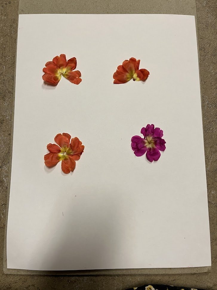
Observe the results–are they as expected? The small, dark pink dianthus I used turned a much darker purple, as did the red coleus leaf. You may wish to do a test sheet (mine is above) with a few different kinds of flowers and leaves before creating your final design. As you can see, not every kind of plant works well!
Out of all my tests, I liked the vibrant colors of the pink and orange moss roses best, so I used those for my finished artwork. Like Hahn, I wanted to play with repetition, so I made a grid of four flowers (really constructions of their petals), then tapped away. I then added some leaves from a different plant.


If you like, you can finish your project with some added drawing or painting. Inspired by Betty Hahn, I used chalk pastels to add a background and some stems to my flowers, but you might place your flowers in a more realistic scene.

Be sure to check out Lush and Lavish: Blooms in Art, on exhibit at FWMoA, through August 28, 2022.