
Alyssa Dumire, Director of Children’s Education
On view through May 30 in Bold Assemblage is a large and complicated sculpture by Steven Sorman called from away. Take a look:
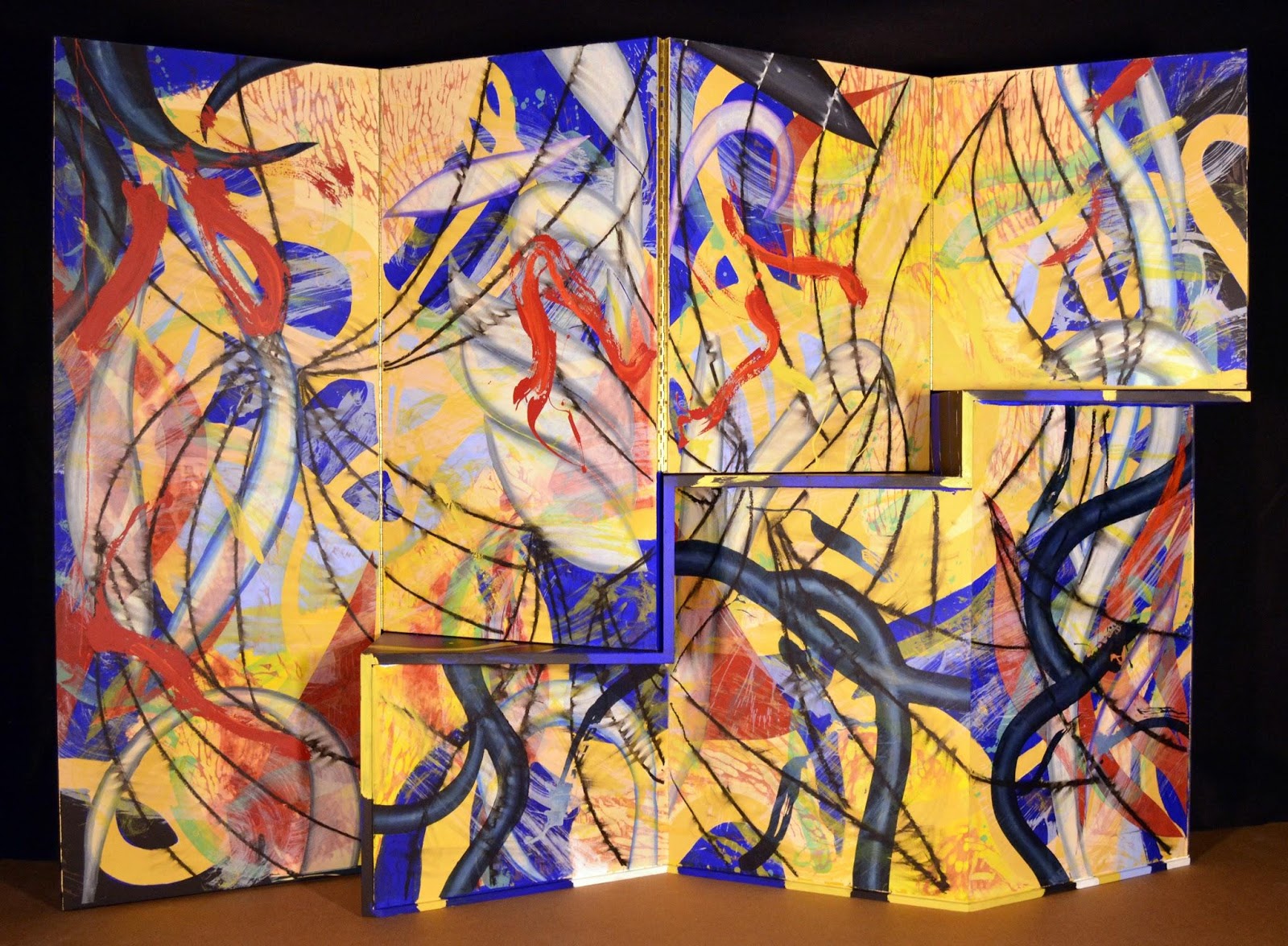
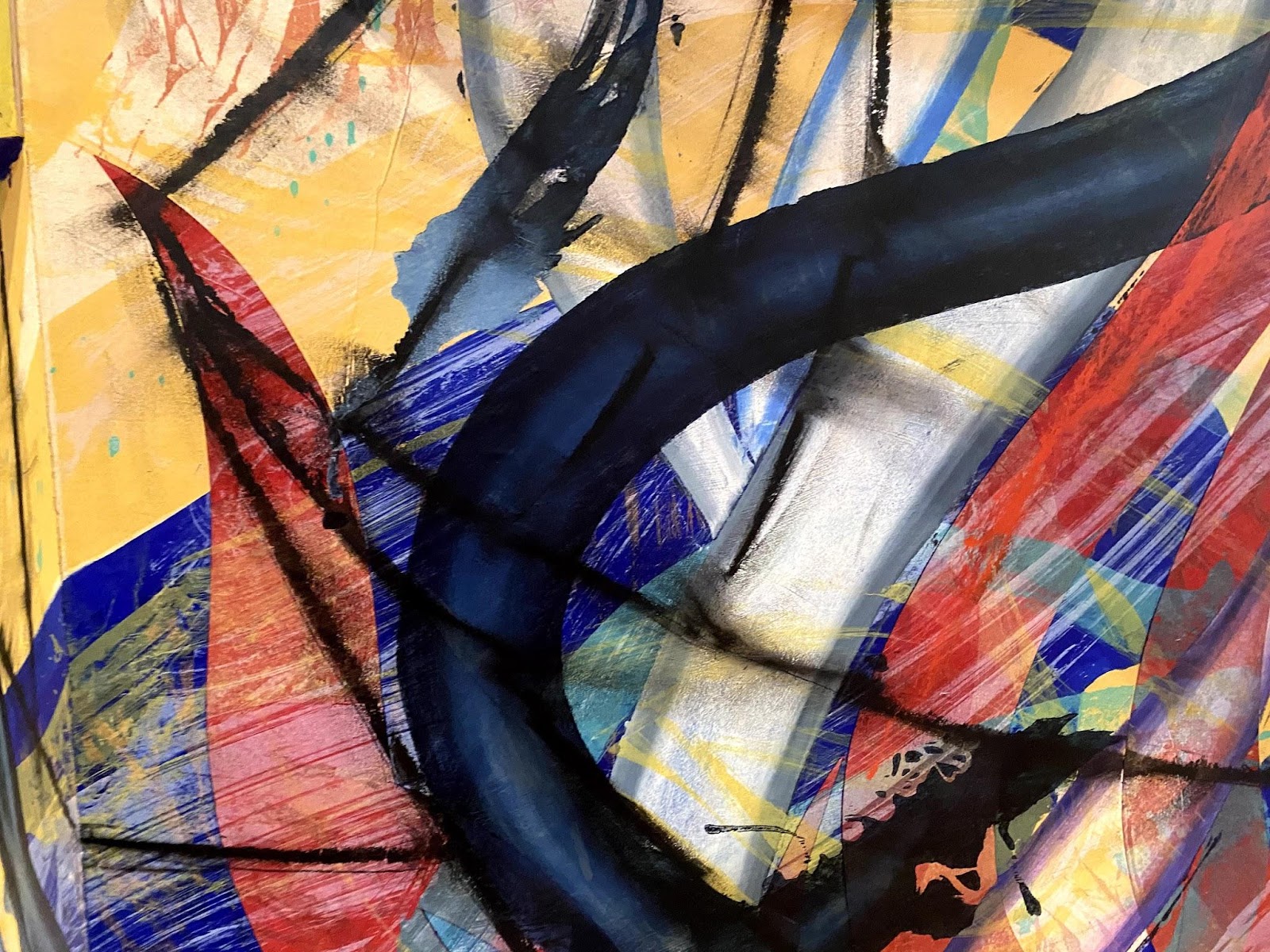
From this side, the wooden screen is composed mostly of bright, primary colors that are painted and printed on in swooping, organic shapes. The label information has a long list of materials: woodcut, lithograph, screenprint, and collage with hand coloring. A true mixed media artist, Steven Sorman has never felt limited to just one technique, combining different types of printmaking with painting and drawing, depending on the type of line he wants to achieve. Take a closer look (below) to see how Sorman has layered different materials and techniques, using woodcut to add a carved texture and black lines across the entire surface.
Now, let’s “walk” around to the other side…
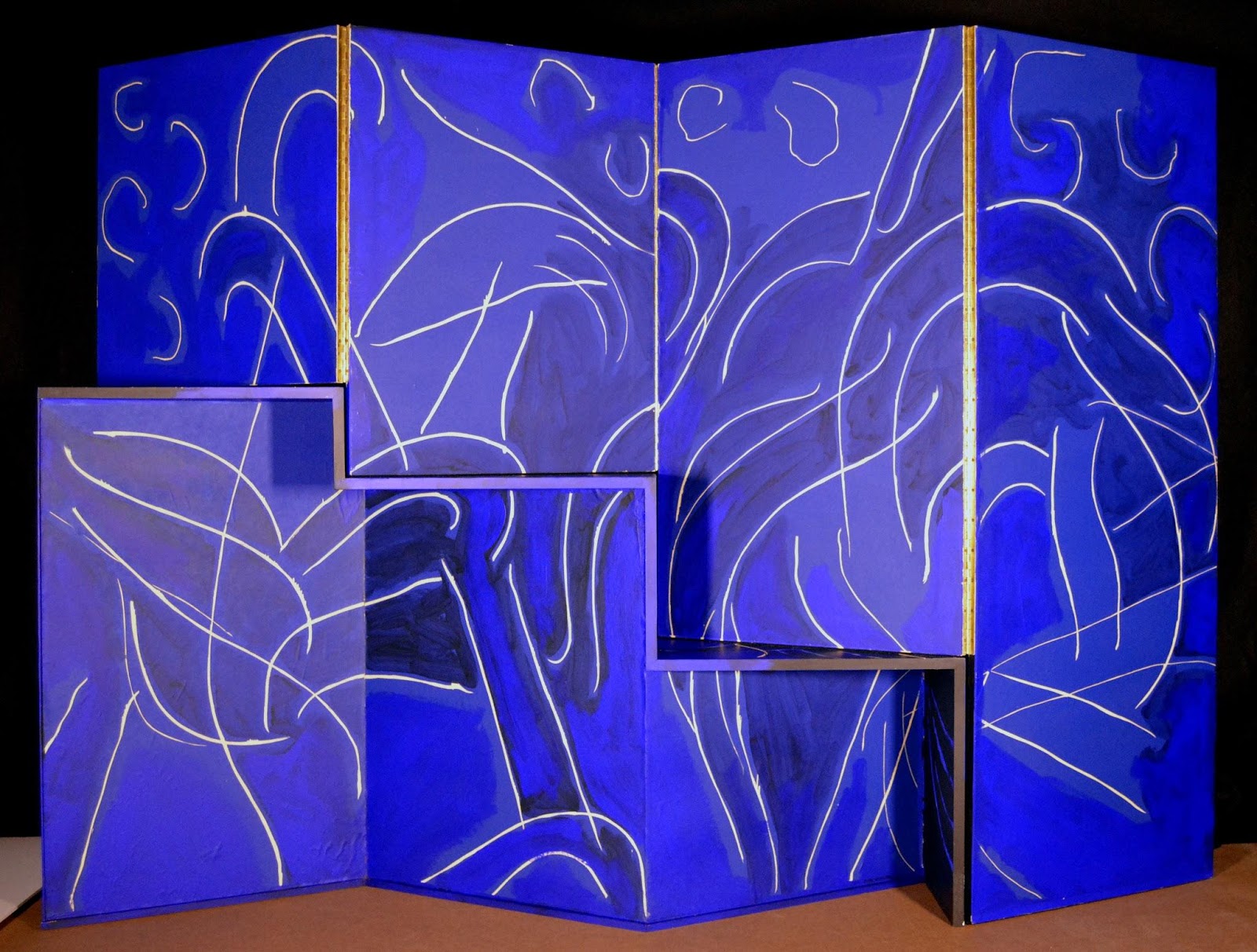
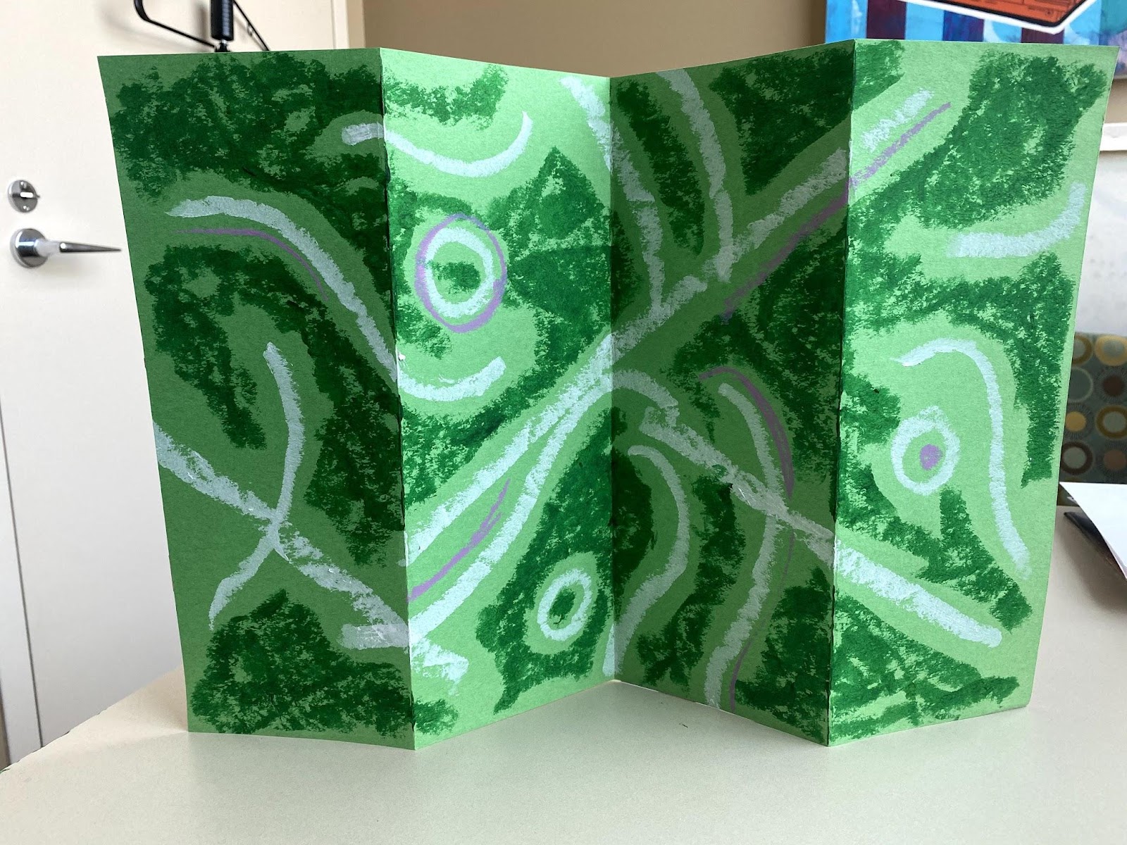
Surprise! Much calmer than the reverse, this side is all shades of vibrant, rich blue with contrasting white lines. It almost feels like two sides of the same fabric, where the blue is the background with different designs printed or woven in. Which side do you prefer?
The two-sided nature of the work brings to mind a lot of either/or questions: Is it one work of art or two? Which side is the front and which is the back (or is there a front and back)? Is it a print/painting or a sculpture? Is it functional or purely decorative? I think the answer to all of these is “Yes!” It doesn’t have to be one or the other, but can be both at the same time. “It’s not about style, it’s not about message, it’s just itself,” Sorman says of his art, “In the simplest words possible, I’ve just spent my whole life seeing what I could do.”
Inspired by Sorman, let’s see what we can do as we explore shape, color, and duality in our own (miniature) mixed-media screens. They may not be large enough to divide a room, but they’re great on a bookshelf–flip it around depending on how you feel that day!
Here’s what you need:
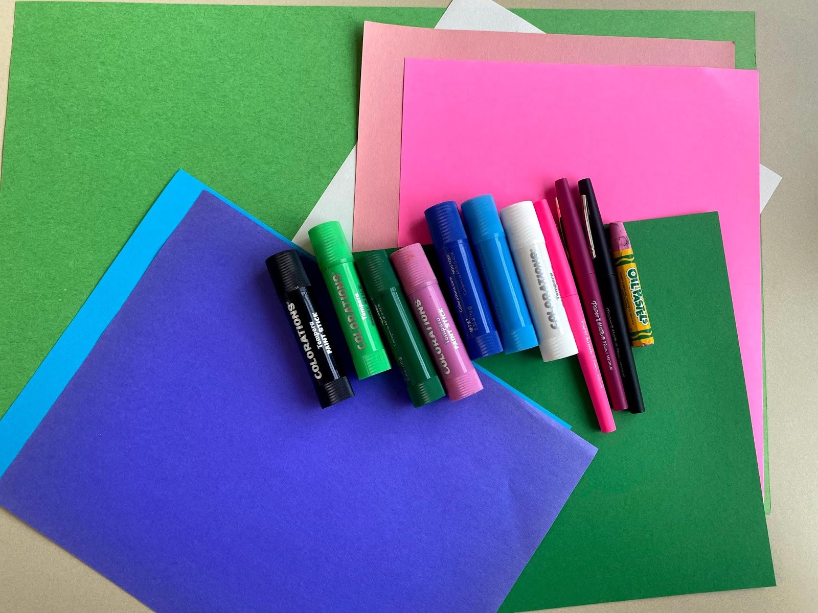
- Construction paper: at least one full sheet (preferably large–I’m using 12”x18” but any size will work), plus scraps in 2-3 colors
- Drawing and/or painting supplies of your choice (I’m using paint stick, oil pastel, and felt-tipped pen)
- Glue or glue stick
- Scissors
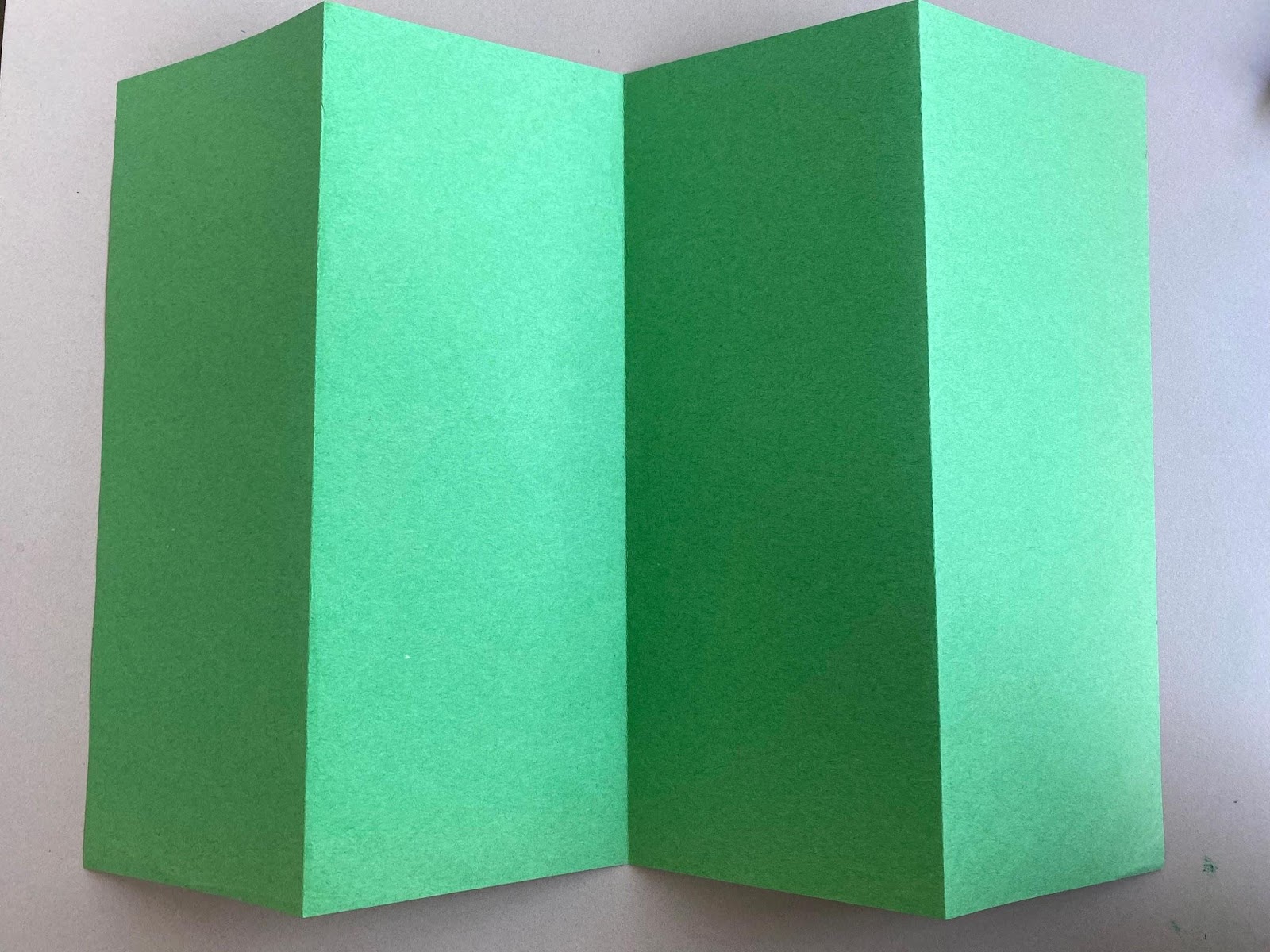
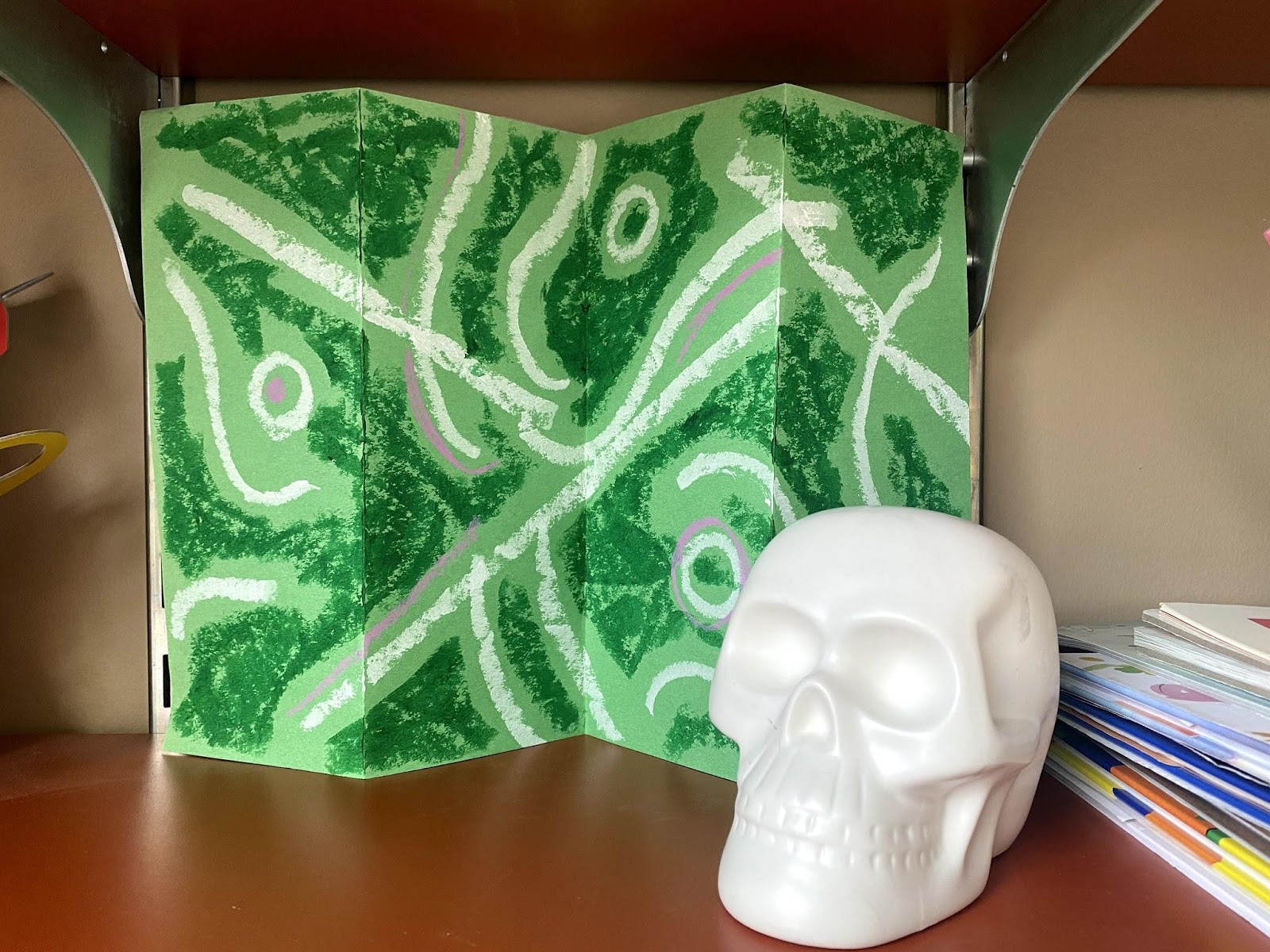
First, decide on a color scheme. Sorman stuck with the primary colors of red, blue, and yellow. You might choose secondary colors (orange, green, and violet), or consult a color wheel to help guide a different selection. I went for greens, blues, and pinks plus black and white. Choose one color for the base, or background, of your screen. This will be like the vibrant blue seen in from away that unifies both sides. If you don’t have paper in a color you like, you can always paint or color it! Pre-fold the background paper (see the green sheet above): fold in half hamburger-style, then fold each edge to meet the fold, so you end up with an accordion fold. Flatten it back out on your table.
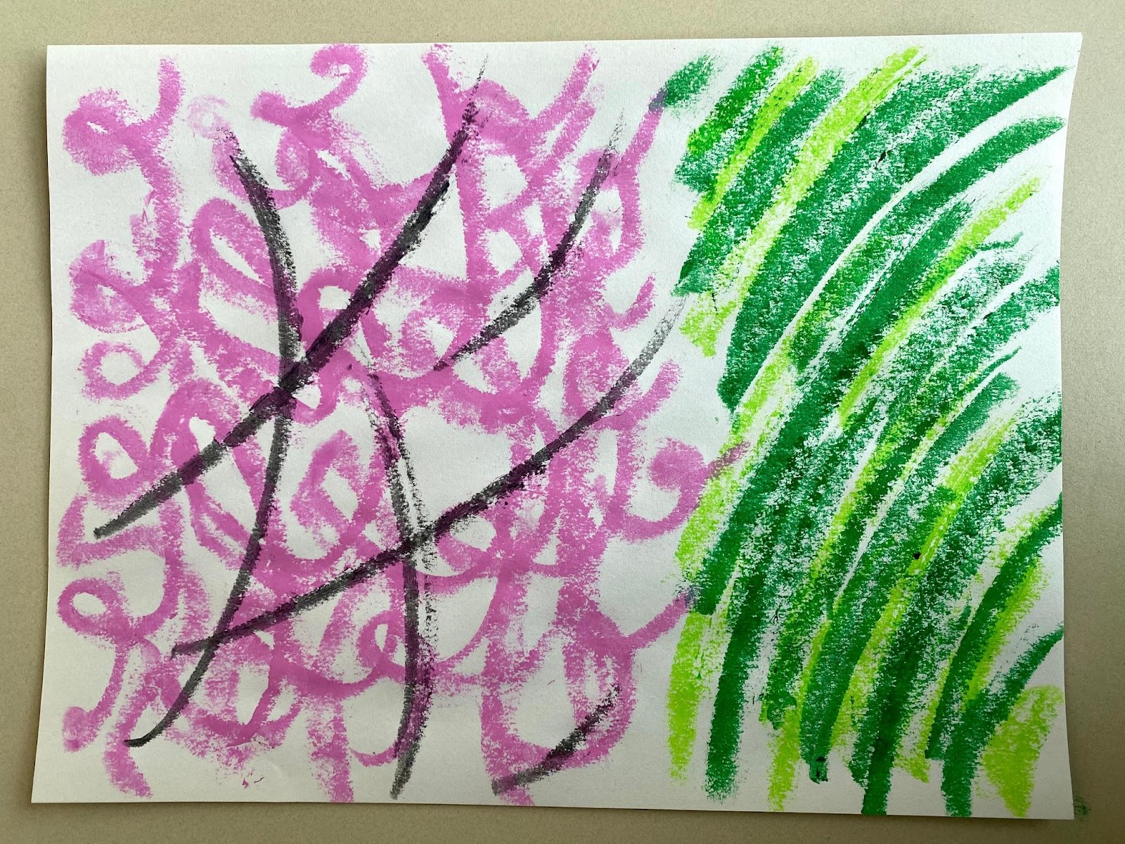
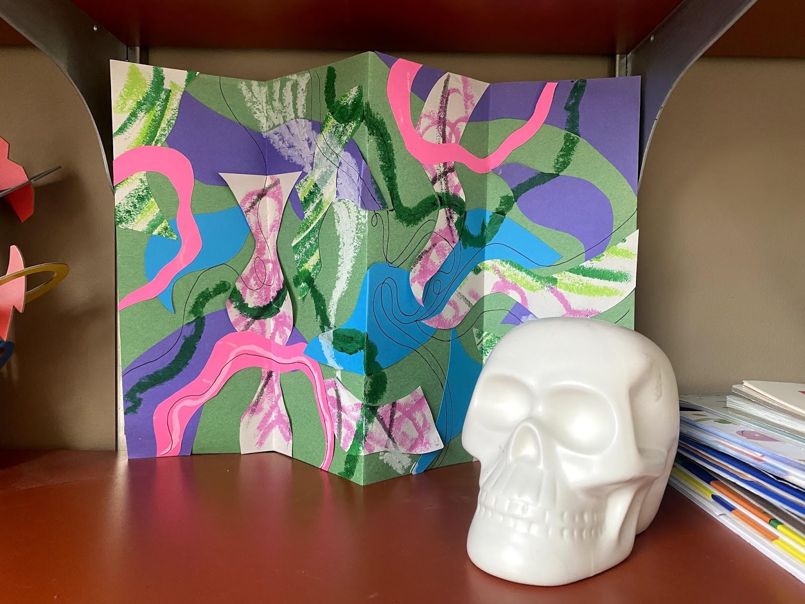
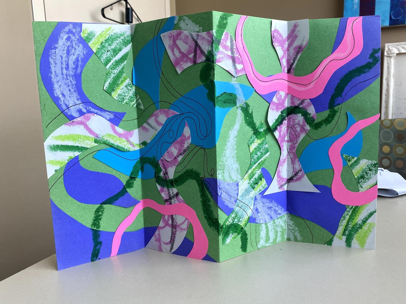
Now, cut out some shapes to collage onto the base. To add some interest and texture, you can first draw or paint patterns on some of your paper. Then, stack two sheets of paper in your chosen colors or fold them in half, and use your scissors to cut out a variety of big, curving shapes. This way, you’ll have pairs of shapes that will repeat across your work to help unify it.
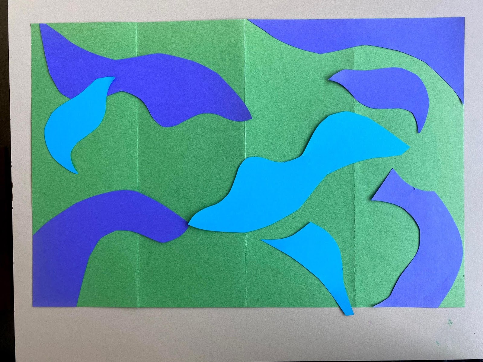
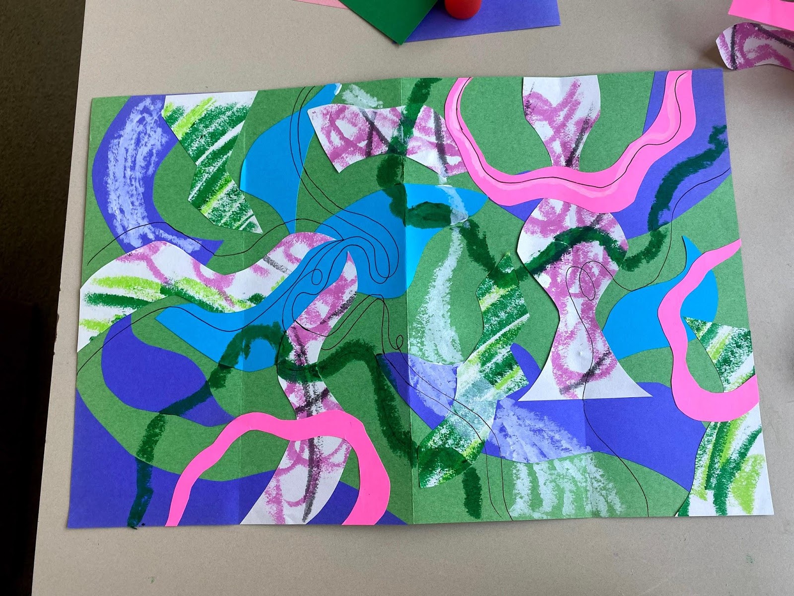
Once you’ve cut out some shapes, begin arranging them on the base, thinking about how they interact with the folds, then glue them down. Draw or paint some longer lines over the top to tie the whole thing together–consider using some thicker and thinner lines.
Flip it over!
The second side of your screen should be calmer and more monochromatic. With white or another contrasting color, draw some calm, curvy lines. Then, use a shade closer to your background to fill in around it and further define the lines you drew. I added a few pink accents to tie it in with the other side even more.
Carefully re-fold the creases with the collaged shapes, and stand it up!
Share your creations with us here on the blog or on our social media: Facebook, Instagram, & Twitter.