

Alyssa Dumire, Director of Education
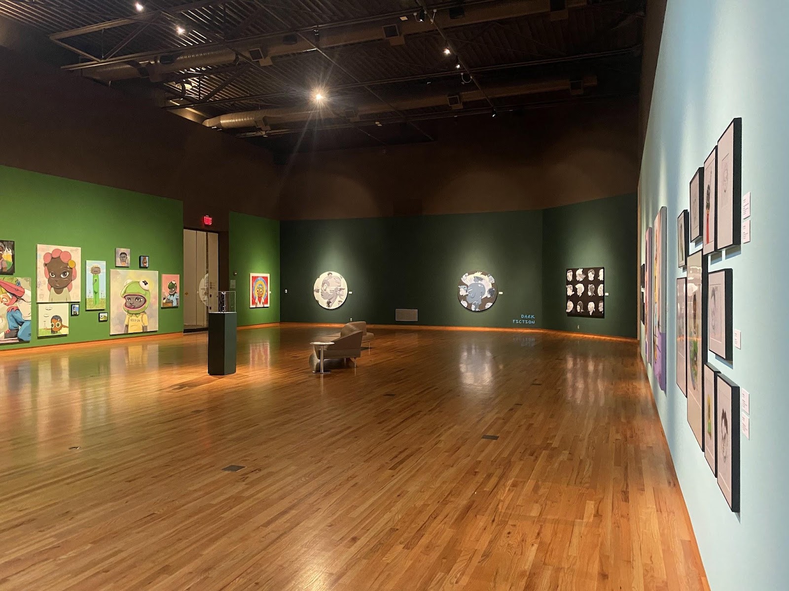
What’s your favorite color? More than any other element of art, colors are closely linked with our identities (especially when we’re young–do you remember bonding with others over a shared favorite hue?) and can deeply impact our emotions. Step into Saints and Shepherds: New Work by Hebru Brantley and notice how different the gallery space, painted shades of deep green and pale blue, feels compared to our usual off-white walls.
A brief definition of color is hardly satisfactory: the property possessed by an object of producing different sensations on the eye as a result of the way the object reflects or emits light (Oxford Languages).
It also hints at the complex, technical nature of color, belied by the fact that sometimes our reactions to it are inexplicable (certain shades of paint make me hungry…for paint). The study of color can be broadly split into a scientific branch, chromatics or colorimetry, and an artistic one, color theory. We’ll focus on color theory; but, as it is informed by the scientific study, we must first delve into a little light physics.
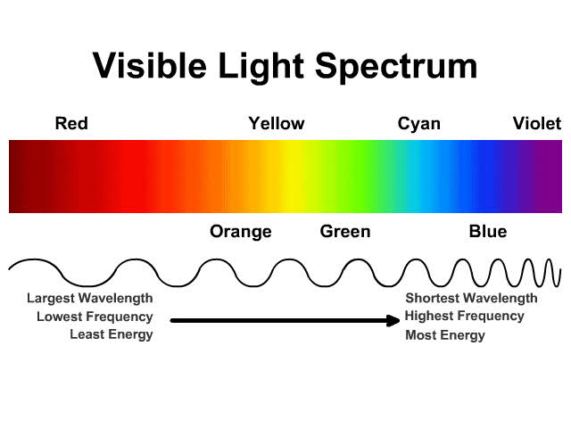
Colors exist on the spectrum of light visible to the human eye, and each has a specific wavelength (we can see roughly ten million colors, but other animals like birds and insects can see even more!). Our old friend Roy G. Biv represents the order of light on the visible spectrum, from short to long wavelength: red, orange, yellow, blue, green, indigo, and violet. When we view an object we perceive the color(s) of light reflected back at us while all the other hues are absorbed or scattered. The cones, or color receptors, in our eyes send that visual information to our brain for processing, which is where things can get weird: see the Op art of Julian Stanczak, below. Understanding color science, Stanczak preferred his work be called “perceptual art” since it impacts the brain’s reaction to color, rather than the purely optical response in our eyes.

But wait, some “colors” don’t appear on the spectrum! That’s because they are a result of our eyes mixing different wavelengths. We perceive white when all of the colors are reflected, while pure black absorbs all the colors and reflects none (which is why you might feel even hotter when wearing a black shirt under the summer sun). Are black and white colors? That’s complicated. In physics, not exactly. But for artistic purposes, sure; although we wouldn’t call a painting in just black and white colorful (it would technically be achromatic), they’re important hues in an artist’s paintbox and come in a range of temperatures and opacities. A color approaching black can be mixed from other colors, but true, dark, neutral black, one that absorbs the maximum amount of visible light, cannot. You may have even heard about the controversy surrounding Vantablack, the darkest black pigment, absorbing 99.965% of all visible light, to which artist Anish Kapoor purchased the exclusive artistic rights in 2016.
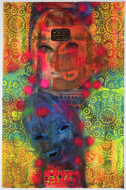
Color theory, which is more practical for artists, studies the relationships between colors and how they impact viewers. Color consists of three components: hue, value, and saturation or intensity. The hue is the distinguishable color: what’s it called? Value is the lightness or darkness of a color. This can be adjusted most simply by adding white or black, which creates tints and shades, respectively. Saturation or intensity is the vibrancy of a color. Think of that sliding scale in a photo editor: when you drag it all the way to zero, the image is in grayscale, while at about 50%, it looks very muted. The colors on a color wheel are at peak intensity, but can be dulled by adding gray or their complement (more on this below). Compare the colors in the two works below: the technicolor of Karl Zerbe with the saturation cranked all the way up, and the much more muted Horace Pippin. How do the colors affect the feel of each artwork?

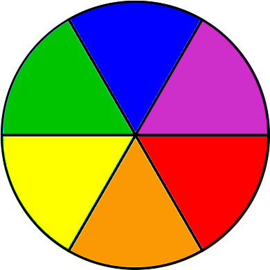
Students in introductory art classes often have to create a color wheel (left) as one of their first assignments, and while it’s not a task that allows for much creativity, it provides an essential foundation in color relationships. On a six-color wheel, there are two triads, color schemes consisting of three evenly-spaced hues. These are the primary colors of red, yellow, and blue; from which the secondary colors of orange, green, and violet are mixed. This system of subtractive color mixing only applies to pigment. Note that colored light, including that on your computer or television screen, mixes according to the additive model, which, to make matters more complicated, uses a different set of primary colors (we’re not getting into that here, but you can play with additive color mixing on our Learning Center light table!). Katja Oxman employs her expertise in color mixing to create her aquatint still lifes, layering only blue, red, and yellow (in that order, below) to result in a full, rich range of tones.


Katja Oxman, American, b. Germany, 1942. Held Slanting in the Sky. Aquatint, 2015. Gift of the Artist, 2016.177.a-c. Images courtesy of FWMoA.
We can also split the wheel in half according to temperature–on one side are the cool colors, while the other half are warm. A cool or warm color scheme can also be described as analogous, which just means the hues are next to each other, resulting in a harmonious effect (often, analogous schemes include tertiary colors like red-orange or yellow-green). Sayaka Ganz’s Cluster, below, employs a cool analogous color scheme, lending a serenity befitting its underwater subject.

Now, pick a hue and find the one opposite it on the wheel: this is its complement. Complementary pairs are bold, energetic, and sometimes conflicting. Movie posters notoriously use orange and blue to create eye-catching promotions that also reveal relationships between characters. When placed directly adjacent, complementary colors can create an intense vibrating effect (look back to the Stanczak print above). In the painting below, David Shapiro used red and green to emphasize the differences between halves of the canvas.

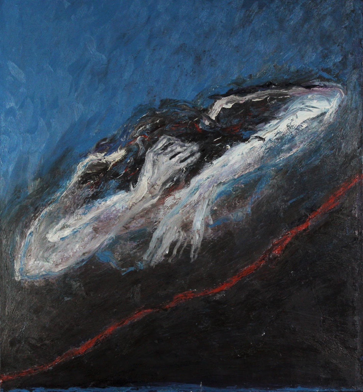
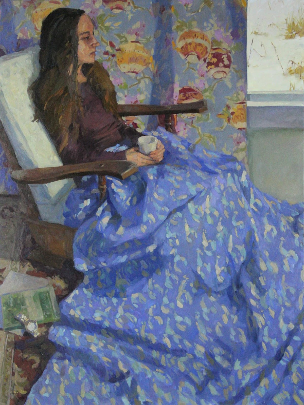
Color might be the most powerful element of art. In all of the examples above, color choices made by the artist acutely impacted not just our visual perception of the work, but also the mood evoked and the symbolic meaning. Colorful terms appear in idioms that describe our emotions: maybe you’re feeling blue, are green with envy, or have on rose-colored glasses. Most emblematic of this is Picasso’s “Blue Period,” during which he created monochromatic works in shades of blue, reflecting his struggles with depression. Is blue always sad? Is red always angry? Our emotional responses to color are really much more complicated, impacted by context and subject, as well as the technical decisions about value and intensity. There are also cultural differences in the colors associated with certain ideas or feelings. Compare the two predominantly blue paintings below: do both evoke the same mood?
4 Replies to “Art Term Tuesday: Color”