
Alyssa Dumire, Director of Education
In our continued exploration of the principles of art, we turn to how artists use size in their work through not one but two closely related terms: proportion and scale. Both refer to relative size, and while we might use the two terms interchangeably in our everyday speech, there is a difference: proportion describes the size of objects within the work in relation to each other while scale deals with the overall size of the artwork, typically in relation to a human. A well-proportioned artwork makes sense to the viewer and tends to be pleasing to the eye, but artists can adjust the relative sizes of elements in a work for creative effect. Likewise, the scale of an artwork might be life-size, or an artist might shrink or blow up an object with vastly different impacts on the viewer.
Proportion
If you ever watch an artist paint or draw from life, you might see them periodically hold up their brush or pencil at arm’s length, squint or close one eye as they view their subject, then return to their work. This odd ritual serves a purpose–using their thumb to mark, the artist can measure the size of various objects in relation to each other, allowing them to accurately transfer their subject from life to paper or canvas. Beginning artists learn general proportions for the human figure using the head as a unit of measurement. During the Renaissance, artists worked to determine these ideal proportions in their efforts to create the most pleasing, harmonious image; think of Leonardo da Vinci’s Vitruvian Man, who fits neatly in his squared circle. It took only around 50 years for the Mannerists to start experimenting with human proportions, lengthening necks and exaggerating curves, not due to a lack of training or anatomical understanding but to lend a sense of instability and tension versus the clarity and idealized perfection of the preceding period. This wouldn’t be the first time in history that artists played with proportion but it demonstrates their fraught relationship with rules, breaking them soon after making them (but for good reason!).
Some artists exaggerate proportion in an unnatural way to tell us what is most important in their work: this is called hierarchical proportion. Children use hierarchical proportion without even realizing it! If you ask a preschooler to draw their family, odds are, they make themselves the biggest figure in the picture. It was a common strategy in ancient Egyptian art, emphasizing the power of pharaohs, and in religious art. A similar technique, with or without exaggeration, is for artists to adjust the amount of space each element occupies in their work. In George Inness’ painting, below, compare the human portion of the work to the area occupied only by nature.

Trees, sky, and meadow occupy the vast majority of the painting, while people and their impact are limited to the left middleground (on your screen, the figures might appear as tiny dots and are harvesting hay). A hallmark of the Hudson River School artists that inspired Inness, the proportions emphasize the majesty of nature over humankind, although both exist in harmony.
Scale
Sometimes, scale is a practical decision. Artists painting en plein air, for example, tend to work at a size that is easy to lug into the wilderness. Preparatory work like sketches or maquettes tend to be smaller than their finished counterparts to conserve time and materials. When we view an artist’s oeuvre, the shift to a larger scale might signal changes in their life: maybe they finally acquired a dedicated studio space or a patron to fund their work.
More often, artists choose to work at a certain scale for expressive reasons. Large-scale works engulf the viewer, occupying our entire field of vision. I’m often inclined to think that bigger is better, but that is not always the case. Smaller works can feel more intimate and personal, often requiring the viewer to get closer to inspect fine details. Mark di Suvero is best-known for sculptures like Helmholtz, made from massive I-beams that require a crane to assemble. Their large scale allows viewers to move in and around them; but his smaller sculptures, like Han Study #3, invite a more intimate form of interactivity. We can imagine reconstructing the puzzle-like artwork (which you can do with the reproduction in our Learning Center).


Scale often dictates the audience of a work, or reveals the artist’s intended audience. Most of us couldn’t house an artwork as large as Helmholtz, or any of the sculptures in front of the museum; they were intended as public artworks. For site-specific public works like murals, the overall scale is predetermined, but artists still decide how to scale their subjects: will they fit their wall with a single, giant figure or populate it with many at a size that is more true-to-life?
Out of all the principles of art, scale might be the one that is most difficult to appreciate on a screen. Without context, it’s difficult to know how large a work is. Devoid of brushstrokes or figures that might give us a clue, can you guess the size of the Dean Fleming painting below?

Now take a look at a gallery view, with second graders for scale:
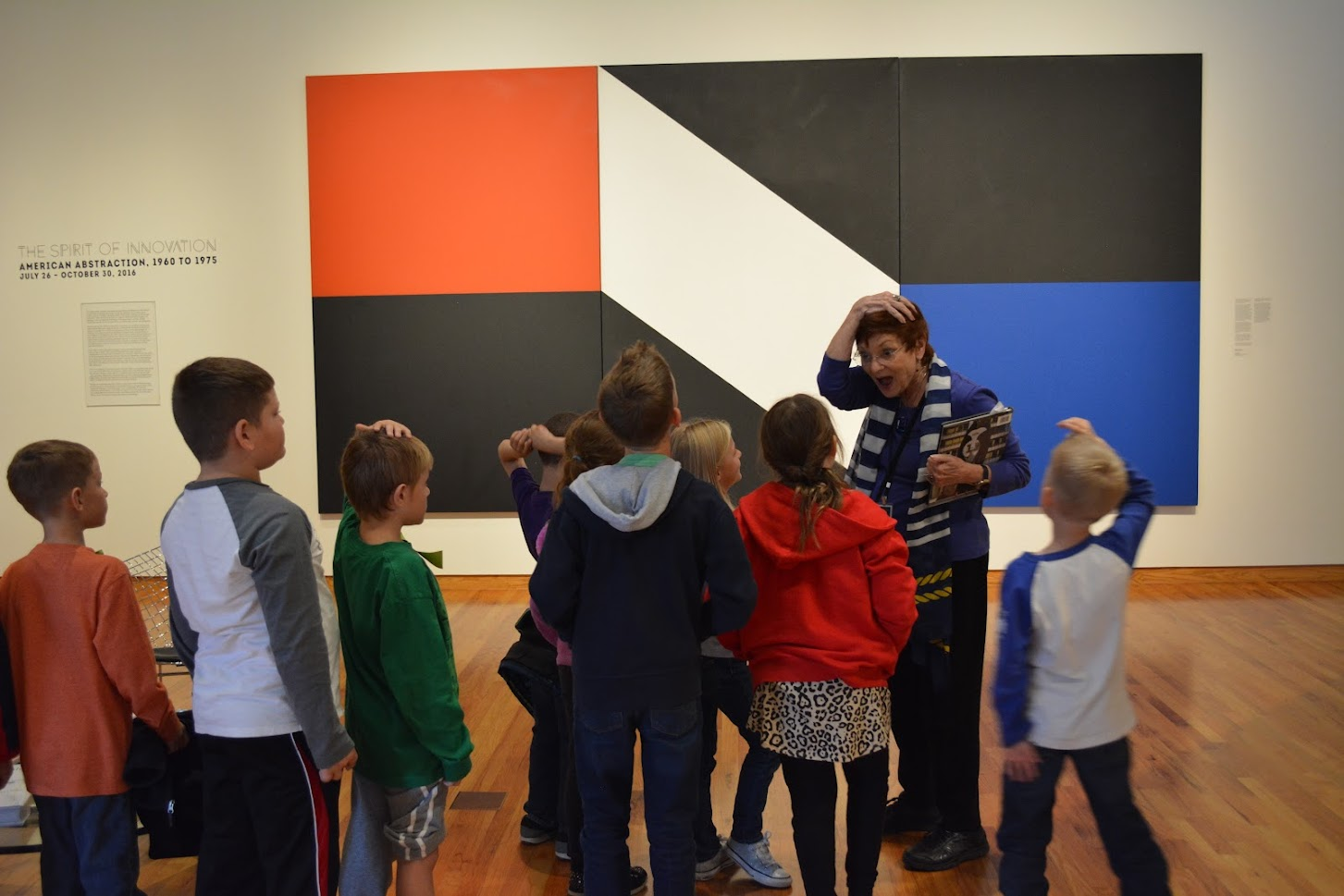
Did you have the same reaction as our former docent, Marlene? At such a large size, its simple shapes and flat colors make a bold statement. Now, consider the proportions of the painting: the black shapes occupy a roughly equal amount of space as the colored and white areas, lending a sense of balance.
Let’s see some other examples of proportion and scale working together!

William Crutchfield calls both into question! Proportionally, the zeppelin above is massive against its lighthouse mooring, but the lack of figures might make us question the scale of the entire scene: is the zeppelin really that big, or is the lighthouse just tiny?


Joel Daniel Phillips’ portraits, displayed in 2019’s Charcoal Testament, owe their sense of realism to accurately captured details, textures, and, of course, proportions. The drawings are also life-size, their scale emphasizing the humanity of each subject and occupying the space as if their sitters were actually in the gallery.
The next time you visit FWMoA, pay close attention to scale and proportion. Consider how a work would change if sized differently, or what messages an artist might be sending by playing with size relationships.
Great article! We , as artists have many tools to engage the viewer in our work, scale is a great one. Showing emphasis where we want the viewer to observe and linger. Many times it’s innate. Thank you for bringing it to our attention!